Data visualisation: The pictures that are worth a thousand words
Rob Mitchell
Studies show that infographics are liked and shared up to three times more than any other type of content. But what makes good data visualisation and how does it apply to thought leadership?
Florence Nightingale is best known as the founder of modern nursing, but what many don’t realise is that she could also claim to be the founder of what we call data visualisation. Her most famous design, the ‘coxcomb’, conveyed complex information about the causes of mortality in Crimean hospitals in a way that clearly showed how better sanitation meant fewer deaths.
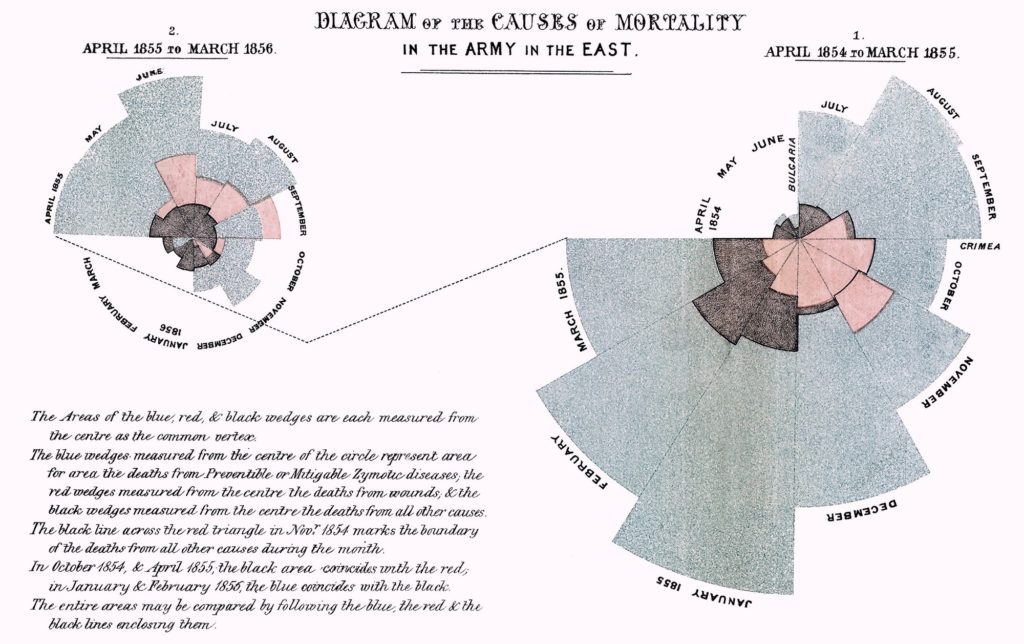
Early infographics by Florence Nightingale: Causes of mortality in Crimean hospitals
Almost two centuries later, the volume of data we have to process and understand has grown to a level that even accomplished statisticians like Nightingale could never have imagined. Making sense of complex data is a huge challenge for today’s business audiences who are bombarded with information and simply don’t have the time to process it all.
In thought leadership, data visualisation can be a powerful form of shorthand. A good graphic can communicate complex concepts simply and quickly, either replacing or supplementing large amounts of editorial copy.
David McCandless, author of Information is Beautiful, describes in his 2010 TED talk how the best data visualisations reveal patterns that would otherwise be hidden. It’s about “solving information problems”, he says.
There are plenty of statistics that illustrate how much easier it to process visual, rather than written, information:
• 65% of us are ‘visual learners’
• 90% of the information that is transmitted to our brains is visual
• Our brains can process images that we are shown for just 13 milliseconds
• Visual images are more likely than text to stick in our long-term memory.
Beyond the science, data visualisation has important advantages from a content marketing perspective. Studies show that infographics are liked and shared up to three times more than any other type of content. They can help with search engine optimisation, and typically lead to higher dwell times than pages that are dominated by text.
What makes good data visualisation?
In our view, good examples of data visualisation have the following characteristics:
- 1. They have a simple concept
-
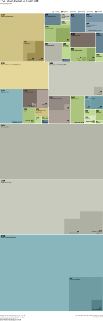
- The best examples have a message that can be understood in a matter of seconds. This is essential in a thought leadership context, when you may only have your audience’s attention for a short period of time. They distil complex information into something straightforward. David McCandless’s
- , which compares large sums of money such as spending on the Iraq War, total global foreign aid and Walmart’s revenues, is a great example of this.
- 2. They save time
- Note, however, that a simple concept is not the same as simple execution. Some highly successful infographics have straightforward concepts but contain a lot of information that can take a long time to digest. The point is that the concept is concise and saves the audience time, compared with having to absorb the same amount of information in text format.
- 3. They have a clear rationale
- Data visualisation experts often distinguish between explanatory graphics and exploratory ones. The former are focused and designed to tell a clear story; the latter do not have a single narrative and instead encourage audiences to find unexpected or hidden patterns in data through their own exploration. Both techniques are valid, but they demand quite different methods, so information designers must decide on their approach right from the start.
- 4. They get creative with their charts
- The best information designers dispense entirely with traditional charts, such as pie charts and bar charts, and come up with less familiar ways of presenting data. This gets their graphics noticed and, more importantly, introduces much-needed variety into the presentation of data. For inspiring charts to incorporate into your data visualisation, visit datavizproject.com.
- 5. They are non-linear
- Basic infographics are consumed in a linear fashion: from top to bottom, as though reading a page of text. These types of infographics can be effective, but they won’t win any prizes for innovation. Rather than simply replacing words with pictures on a top-to-bottom page, the most creative data visualisation tends to be non-linear in structure and more conceptual.
- 6. They avoid distortion
- One trap we sometimes see companies falling into is visualisation that distorts the underlying data. It’s easy to manipulate data using graphics – by adjusting scales on charts for example. While this might allow companies to highlight a message that suits their needs, it greatly undermines their credibility when audiences spot this sneaky tactic.
- 7. They should say something new
- In our client work, we apply the same rules to data visualisation that we apply to all of our thought leadership: it must say something new, it must be insightful, and it must add to the conversation. Dressing up a mundane or familiar argument with smart graphics isn’t likely to fool our savvy business audiences.
- 8. They look good
-
- Elegant design is essential. A simple colour palette, an uncluttered, eye-catching, balanced layout and minimal text are all critical to communicating clearly using graphics. The best infographics rely on
- . This psychological concept explains the way our brains perceive visual arrangements – for example, how we perceive elements that look similar as part of a group.
Speak to the team
We’ll help you to navigate and overcome any challenges you currently face and learn how to get more out of your content.
Book a meeting
About the author: Rob Mitchell
Rob is our CEO and co-founder and leads FT Longitude’s strategic planning and sets the overall vision and priorities for the business. He manages the board-level relationship with FT Longitude’s parent company, the Financial Times group, and also oversees FT Longitude’s finances, people management and administration.
Prior to co-founding FT Longitude in 2011, Rob was an independent writer and editor. Between 2007 and 2010, he was a managing editor at the Economist Intelligence Unit and prior to that he was an editor at the Financial Times, where he was responsible for the newspaper’s sponsored reports, including the Mastering Management series.
 |
Tel:
+44 (0)20 7873 4770
|
Tel:
+44 (0)20 7873 4770