An Eye for Data: How visual storytelling transforms content campaigns
Ben Harrison

An interview with Emma Hicks, Head of Information Design at FT Longitude
FT Longitude’s new head of information design, Emma Hicks, joins us to discuss our data visualisation offering and tell us how visual storytelling can transform B2B content campaigns. She works closely with our specialists in research and data journalism to make our clients’ content more impactful, engaging and shareable.
FT Longitude isn’t exactly your typical design agency. What attracted you to thought leadership?
I guess I’m not your typical designer! I was attracted by FT Longitude’s top-class editorial team and their ability to produce great stories based on data. The eternal struggle of an information designer is having to deal with poor-quality data, so knowing that the numbers come from such an expert team is a dream for someone like me. Using bad data sets, with no focused narrative or direction, makes it so difficult to construct the kind of visualisations that captivate audiences.
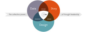
Data, story and design. For me, these are the essential components of storytelling with data. The fact that we have all of three of these pillars here at FT Longitude is what really sparked my interest in the role.
Our audience will be familiar with data visualisation, but could you give us some background on information design?
Basically, it’s about communicating visual information clearly and efficiently. Or to put it another way, good information design takes complex ideas and abstract concepts and makes them simple and easy to understand.
I can think of numerous examples that do this so effectively – some from before we had computers to help us sort through the data efficiently. These examples make it abundantly clear that you will always know good design when you see it.
How can good data visualisation change the way audiences experience thought leadership?
B2B storytelling isn’t what it used to be. Nowadays, it’s not always enough to produce a well-written story and assume your audience will read it.
That’s where the opportunity lies for information design: by visualising what you want to say, you can transform that story into a holistic experience instead of a one-off asset. These new ‘content experiences’ allow you to engage your audience in a powerful way, with multiple touchpoints, and breathe life into what might be a relatively dry topic or theme.
A high-end interactive data tool – such as EY’s corporate reporting survey – goes even further, and allows readers to explore the narrative in a way that suits them. They can discover stories within stories, and find nuances in the data by filtering and manipulating the output to get a visual report that’s tailored to their needs. In the end, I like to think that they’ve become the conductor of their own personalised content.
Brand stories used to be very linear. They were very much an ‘A to Z’ experience, with the story told in chronological order, and thought leadership was no different. But it doesn’t have to be like that. Imagine the main narrative as the trunk of a very large tree. If it’s built on high-quality data, then it can feed an almost limitless number of offshoots – the branches – that represent a much more varied set of outputs.
I’m not saying that the 6,000-word report is dead, but today’s readers demand more.
And how does good information design help brands achieve their marketing objectives?
Just think how much more engaging a visual digital experience is than a standalone key findings report. Now think about how much more effectively it could drive your target audience through your decision-making funnel.
From brand awareness through to decision-making influence, an interactive, digital campaign strategy can help you to curate visual content for every stage of that process, and FT Longitude has seen the benefits of that first hand with our very own thought leadership.
Do you have any tips for marketers who want to enhance their thought leadership campaigns with design?
There are a few really key ones. The first is a no-brainer for marketers, but is often forgotten in data viz: always have a call to action. Traditional marketing collateral is full of clear action points, but they’re often missed from great pieces of design, and are essential – even if only to help you prove your ROI.
Secondly, remember to keep it simple. The main purpose of data visualisation is to allow your audience to consume information faster than they would with a block of text or numbers. If they’re using that precious brain power to decipher your visuals, they’ll probably lose interest.
And lastly (although I could go on and on), remember that designers solve problems – so communicate with them. A good designer uses empathy to understand the brief. By putting themselves in other people’s shoes, they set aside their own assumptions and gain vital insights into the audience and its needs. We then come up with ideas – quickly – and test them, and if necessary come up with new ideas, and test them. This kind of iterative process will give marketers an optimised design that efficiently (and often beautifully) communicates what they want to say.
Explore our guide to developing your thought leadership strategy for your go-to resource for on planing, developing and executing a strategy.
Speak to the team
We’ll help you to navigate and overcome any challenges you currently face and learn how to get more out of your content.
Book a meeting
About the author: Ben Harrison
As Digital Marketing Manager, Ben leads various marketing activities such as the firm’s social media effort, our always-on content programme, and all aspects of the website – from maintenance to re-designs. He also manages the department’s tech stack, delivering an increasingly seamless experience from marketing all the way through to the sales team.
Ben also contributes to the marketing team’s overall strategy and goals, helping to plan, execute and effectively measure all our content and engagement that push the firm towards brand- and commercial-oriented goals.
 |
Tel:
+44 (0)20 7873 4770
|
Tel:
+44 (0)20 7873 4770